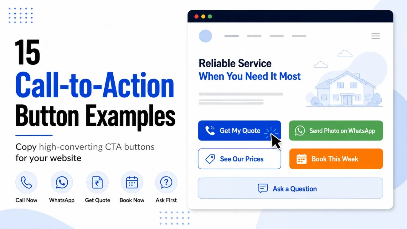
Call To Action Button Examples: The button is the smallest piece of writing on your website and the only one that people have to act on, which makes it strange that most business owners spend an afternoon on their home page and about four seconds on the word sitting inside the box at the bottom of it. That word is usually “Submit”, or “Learn More”, or “Contact Us”, and all three of them are doing far less work than they could be. The call-to-action button examples below are ones you can copy straight onto your own site, and each one comes with the reason it works, so you can change the wording to fit your trade instead of pasting it blindly.
None of this requires a designer or a new website. In most cases you are changing two or three words inside a box that already exists.
Why the button matters more on a local business website
On a large shopping website, people click buttons all day without thinking, because they already know what happens next and the risk of being wrong is small. On a local service website the situation is different, because clicking usually means a phone call with a stranger, or handing over your number and waiting to see what arrives, and people are much more careful about that than they are about adding a shirt to a basket.
So the visitor pauses at your button, and in that pause they are asking a very ordinary question, which is what will actually happen if I press this. A button that answers the question gets pressed. A button that says “Submit” leaves them guessing, and a person who is guessing usually leaves the page and tries the next business on the list.
The one rule behind every button on this page
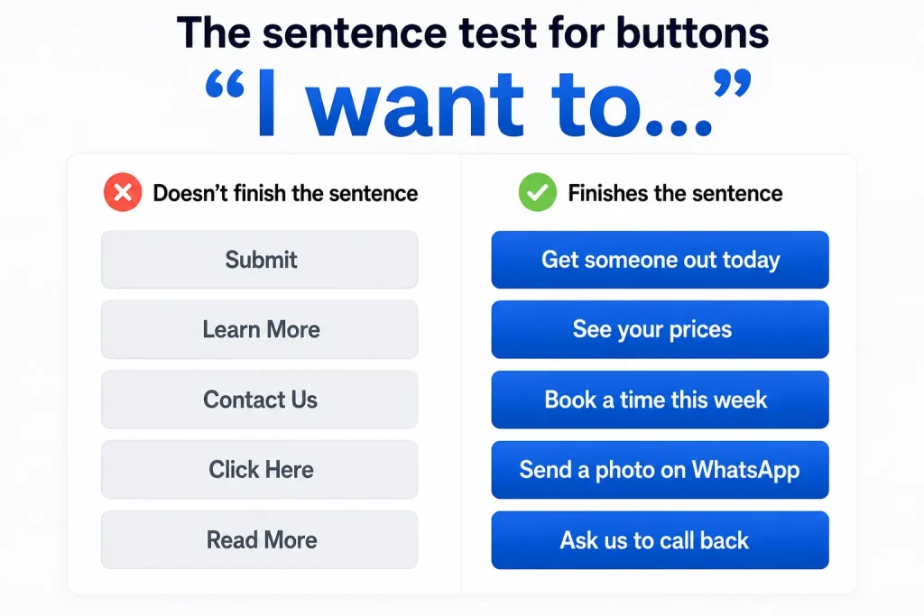
There is a simple test that will fix most buttons in about ten seconds, and it is this. Take the sentence “I want to…” and see whether your button finishes it properly.
“I want to… Submit” is not a sentence anybody has ever thought. “I want to… Learn More” is technically a sentence but it is not a thing anybody wants, because nobody wakes up wanting to learn more, they wake up wanting a blocked drain cleared or a price for a haircut. But “I want to… get someone out today” is exactly what the person is thinking, and so is “I want to… see your prices”, and that is why those buttons get pressed.
The second half of the rule is that the button should describe what the visitor gets, not what your website does. “Send” describes what the form does. “Get my quote” describes what the person receives. It is the same click, but the second version is written from the visitor’s side of the screen.
15 call-to-action button examples you can copy
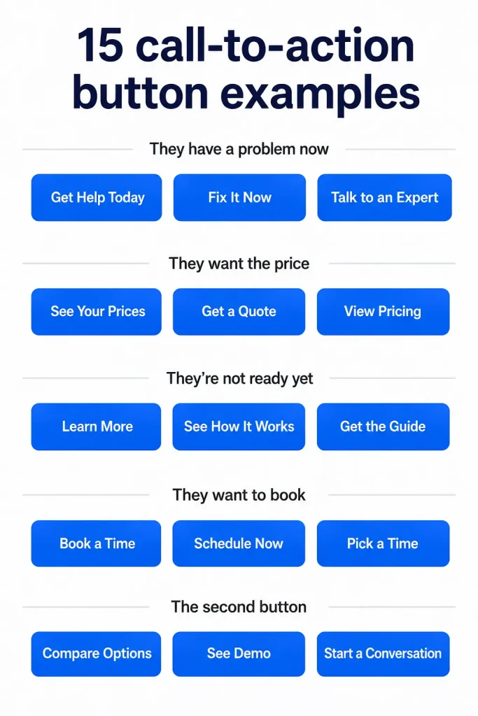
These are grouped by the state of mind the visitor is in when they reach the button, because the same business often needs different buttons on different pages. A person landing on your emergency page is not the same person reading your gallery, and giving both of them the same button wastes one of them.
For a visitor who has a problem right now
1. Call now — we answer until 10pm
The words after the dash are doing most of the work here, because the thing stopping somebody from calling a stranger at half past eight in the evening is the fear that nobody will pick up. Telling them the hours removes that fear at the exact moment it appears, and it costs you nothing but the honesty of keeping to it. Change the time to whatever is true for you, and if you only answer until six, say six.
2. Send a photo on WhatsApp
This is the strongest button in India for most home service trades, and it works because it is easier than the alternative. Calling means explaining a problem you do not have the words for, whereas photographing a leaking pipe takes two seconds and says more than the caller could. It also gives you a better first message than a phone call would have done, since you can see the job before you reply.
3. Get someone out today
Notice that this promises a person arriving, not a form being sent, and that is the outcome the visitor actually wants. Only use it if you can usually manage it, because a button that promises today and delivers Thursday will cost you more in trust than the click was worth.
For a visitor who wants to know the price first
In India especially, price is the first question rather than the last, and a website that hides it loses people who would have been happy with the number. These three buttons all deal with that directly.
4. See our prices
Plain, and that is the point. If you have a price page, this button will often outperform every clever thing you could put in its place, because it is the one thing a large share of your visitors came looking for.
5. Get a fixed quote in 20 minutes
The time promise is what makes this work, since “get a quote” sounds like the beginning of a long back-and-forth and nobody wants to start one of those on a Tuesday morning. Put a number in there that you can keep, whether that is twenty minutes, the same day, or by tomorrow evening.
6. Check the cost for your area
Useful when your prices genuinely change with distance, and useful again because it quietly tells the visitor that you work in areas, which is the question sitting behind half of all local enquiries. This one pairs naturally with your location pages.
For a visitor who is interested but not ready
Most people who visit a local business website are not going to buy today, and a page that only offers “Call Now” gives those people nothing to do except leave. A second, gentler button catches them.
7. See what we’ve done nearby
This works because it is low risk and high curiosity, and because the word “nearby” turns a general gallery into something about them. Somebody who clicks it is warmer than they were, and often calls after looking.
8. Ask a question first
The word “first” is what makes this one work, since it gives permission for the visitor to not be ready, which is exactly how they feel. It converts people who would never have pressed a button labelled “Contact Us”, because contacting sounds like committing and asking does not.
9. Send me the price list
Good for trades with a long list of standard jobs, such as salons, cleaning services, tuition centres and labs. It works partly because it is written in the visitor’s voice rather than yours, using “me” instead of “us”, which is a small trick worth borrowing on any button where the visitor is receiving something.
For appointments and bookings
10. Book a time that suits you
The last four words remove the objection, which is that booking online means being given a slot rather than choosing one. Salons, clinics of the non-medical kind, driving schools and photographers all do better with this than with a bare “Book Now”.
11. Check this week’s slots
Softer than booking, because checking is not committing, and it works well as the main button on a page for a business that is often busy. It also creates a mild sense that the slots are finite, which is true, and you are not pretending otherwise.
12. Book a free 15-minute visit
Two objections handled in five words, since “free” answers what it will cost and “15-minute” answers how long they are being trapped for. If your first visit is not free, say the price instead, because “book a ₹300 inspection” still works and a surprise later does not.
For the second button on the page
Every important page should have a main button and a smaller, easier one beside it, because roughly half your visitors are not ready for the main one and you would rather have them on WhatsApp than on your competitor’s website.
13. Ask us to call you back
Perfect for people who cannot talk right now, which includes anybody sitting in an office or on a train, and that is a larger group than most owners assume. Add “we’ll call within the hour” underneath if that is true.
14. Message us instead
The word “instead” only makes sense next to a Call button, which is exactly where it belongs, and it quietly acknowledges that some people would rather not speak on the phone. Younger customers pick this one far more often than owners expect.
15. See photos from jobs near you
The lowest-commitment button on the list, and the right one for the bottom of a page where the visitor has read everything and still not moved. Nobody is scared of looking at photographs, and photographs are what sells painting, interiors, salons and event work anyway.
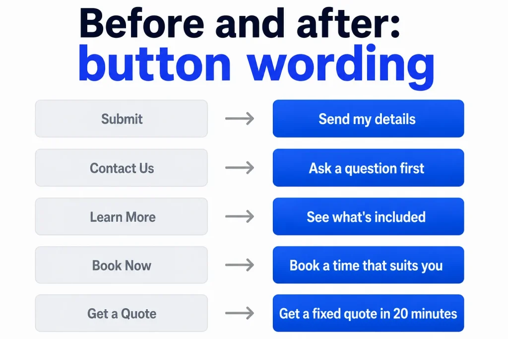
The same buttons, before and after
Reading the change next to the original is usually what makes it click, so here are common buttons and what they become when you apply the sentence test.
| What most sites have | What to write instead |
|---|---|
| Submit | Send my details |
| Contact Us | Ask a question first |
| Learn More | See what’s included |
| Click Here | See our prices |
| Read More | See what we’ve done nearby |
| Book Now | Book a time that suits you |
| Get a Quote | Get a fixed quote in 20 minutes |
| Enquire | Ask us to call you back |
| Call Us | Call now — we answer until 10pm |
None of these rewrites are clever, and none of them needed a copywriter. Each one simply says the thing the visitor was already hoping for.
Words to take out of your buttons
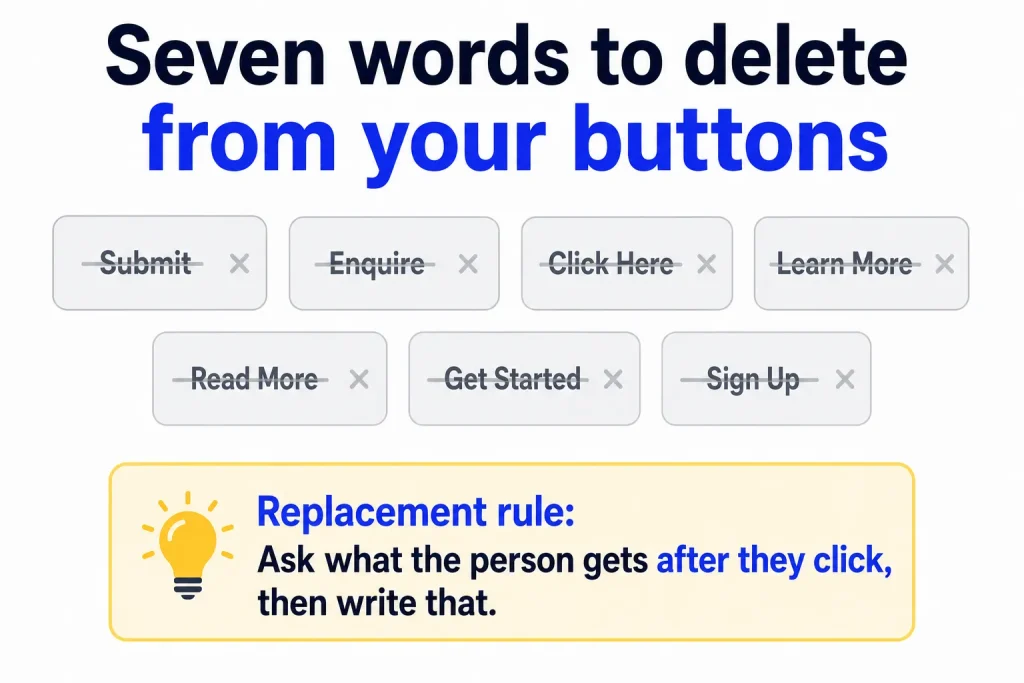
Some words appear on buttons purely out of habit, and they all share the same problem, which is that they describe the mechanics of the website rather than anything the visitor wants.
- Submit — nobody has ever wanted to submit anything, and the word sounds like paperwork
- Enquire — a formal word for a simple thing, and one that many readers would never say out loud
- Click Here — describes the physical action, which the visitor had already worked out
- Learn More — vague enough to fit any page, which is exactly why it belongs on none
- Read More — same problem, and it promises reading rather than a result
- Get Started — copied from software websites, where it makes sense, and borrowed by local sites where it does not
- Sign Up — sounds like a mailing list even when it is not, so people hesitate
The replacement is always the same idea. Ask what the person gets on the other side of the click, and write that instead.
The line above and below the button
The button rarely works alone, and a short line of text either side of it will often do more than changing the button itself.
Above the button, answer the question the visitor is still holding, which is usually about cost or commitment. A line such as “Quotes are free and take about twenty minutes” clears the way for the button underneath it to be pressed.
Below the button, remove the fear of what happens next, since people hesitate over forms mainly because they imagine being called eleven times by a sales team. A line such as “We’ll reply once, and if you don’t want to go ahead, that’s the end of it” is short, honest, and does more for your form completions than the button wording ever will.
Where the buttons go, and how many
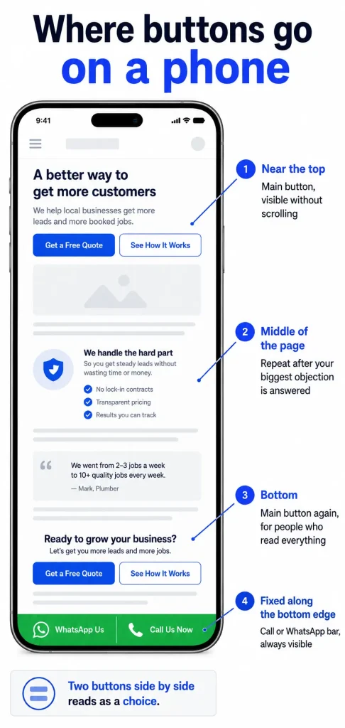
Almost everybody reading your site is on a phone, so think in terms of a narrow screen scrolled with one thumb rather than a wide page seen all at once.
Put your main button near the top, where it is visible without scrolling, and repeat it at the bottom of the page for the people who read everything before deciding. On a long page it is worth adding one in the middle as well, usually just after the section where you have answered the biggest objection. Beyond that, more buttons will not help, and a page covered in them starts to feel like it is chasing the reader.
The second, gentler button belongs beside the main one rather than under it, so that the two read as a choice rather than a queue. And on mobile, a fixed call or WhatsApp bar along the bottom of the screen is worth having, because it means the visitor never has to scroll back to find you.
How to find out whether it worked
You do not need testing software for this, and most local businesses would never get enough traffic to run a proper test anyway. What you can do is change one button, leave it alone for a month, and count the enquiries against the month before, while remembering that seasons move these numbers as much as wording does.
The more useful measure is what people say when they arrive. If callers start opening with “I saw the price on your site”, or messages start coming in with a photograph attached, then the button did its job, and you can go and change the next one.
Frequently asked questions
How long should a call-to-action button be? Two to six words is the range that works, and the shorter end is better on mobile because a button that wraps onto three lines looks broken. If the wording you want will not fit, move the extra part into a small line of text underneath rather than squeezing it inside the box.
Should the button be in capital letters? Sentence case is easier to read, so “See our prices” rather than “SEE OUR PRICES”. Full capitals slow reading down slightly, and on a phone they take up more space than you can spare.
Can I use the same button everywhere on my site? Your main button can be consistent, and there is an argument for that, but the button on your emergency page should not be the same as the button on your gallery, because the two visitors are in completely different states of mind. Match the button to the page, not to the site.
Does button colour matter more than the words? Colour matters less than most people think, and the only real rules are that the button should stand out from everything around it and that you should not use the same colour for buttons and for ordinary links. Once it is clearly visible, the words are doing the work.
What to do next
Open your own website on your phone, scroll to the first button you see, and read it out loud with “I want to…” in front of it. If the sentence sounds like something a real customer would think, leave it alone. If it does not, pick the closest example from the fifteen above and change it now, because it is a two-minute job and it is the cheapest improvement available to you.
After that, the page worth looking at next is your About page, since a strong button underneath a page of vague claims will still be ignored. Here’s how to write an About page people actually believe.

5 thoughts on “15 Call To Action Button Examples for local business websites”