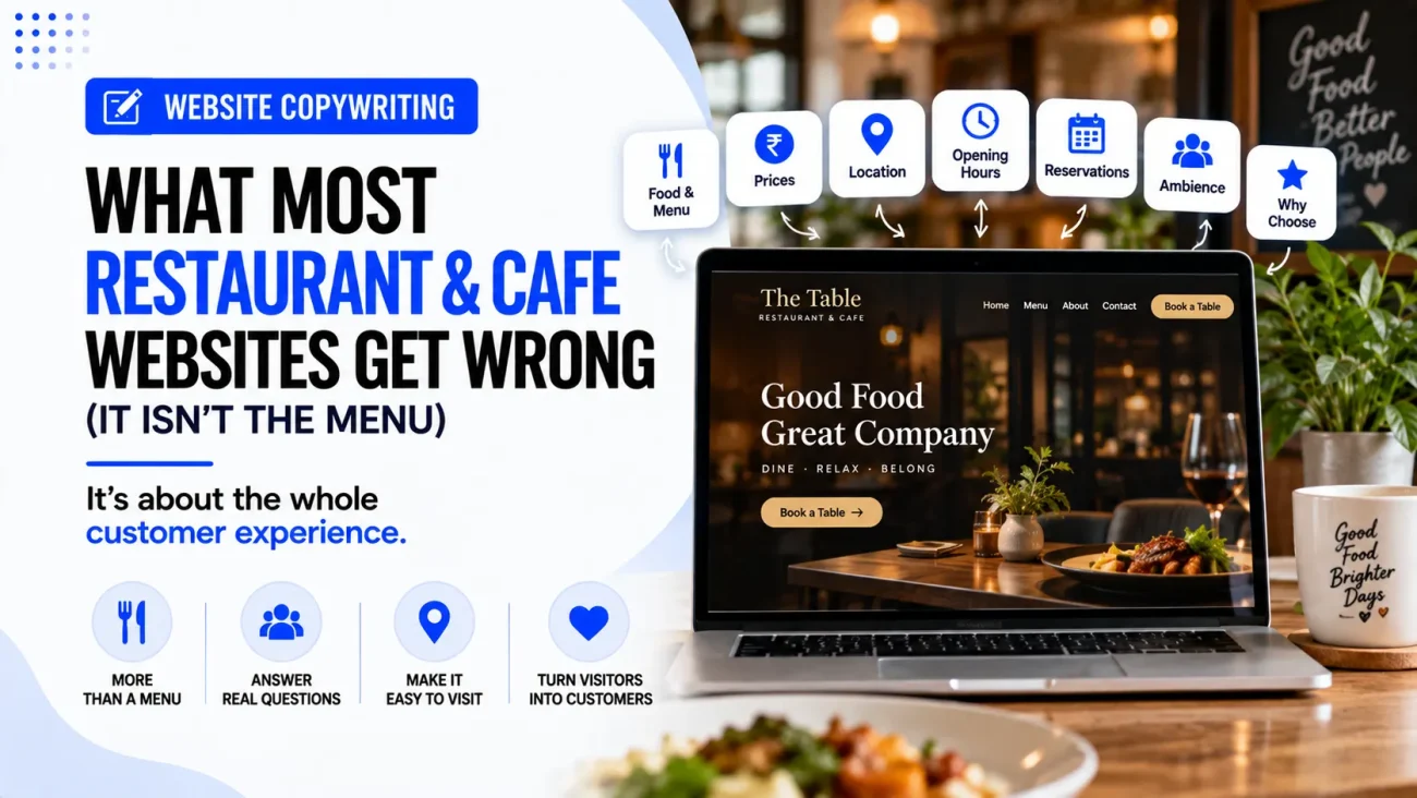
When people talk about restaurant websites, the first thing they usually discuss is the menu. Is it easy to find? Are the prices visible? Is it mobile-friendly? Is the PDF updated? These things are important, but the menu is not always the biggest problem. A restaurant website can have a good menu and still fail to turn visitors into bookings, calls, orders or visits because the rest of the website does not answer the simple questions people have before choosing a place to eat.
A person visiting a restaurant website may want to know what kind of food is served, but they also want to understand the atmosphere, location, opening hours, price level, parking, reservation options and what makes the restaurant different from the other places nearby. If the website makes these answers difficult to find, the visitor may simply return to Google and choose another restaurant. This is why Restaurant Website Copywriting Mistakes are often less about writing a bad menu and more about failing to help customers make a decision.
A good restaurant website should work almost like a helpful member of the restaurant team. It should tell people what they can expect, answer the common questions before they need to ask them and make the next action easy. The design and photographs obviously matter, but the words are what explain the experience and guide the visitor towards booking a table, ordering food, calling the restaurant or getting directions.
The Real Problem: Restaurant Websites Often Describe The Restaurant Instead Of Helping The Customer
One of the most common Restaurant Website Copywriting Mistakes is writing about the restaurant from the owner’s point of view rather than the customer’s point of view.
For example, a restaurant homepage might say:
“We are a family-owned restaurant established in 2015, offering authentic flavours made with the finest ingredients in a warm and welcoming environment.”
There is nothing wrong with this sentence, but it does not answer enough questions for someone deciding where to eat tonight. A visitor may still be wondering what type of food is served, what the price range is, where the restaurant is located, whether reservations are accepted and whether the place is suitable for their particular occasion.
A better approach is to combine the restaurant’s story with information that helps the visitor decide.
“Serving North Indian and Mughlai dishes in central Ghaziabad, our restaurant offers casual family dining, private seating for small groups and takeaway. Check our menu, see today’s opening hours or reserve a table before your visit.”
The second version still communicates the restaurant’s identity, but it gives the customer something useful to act on.
What Customers Actually Need From A Restaurant Website
Before writing any restaurant page, it helps to understand what people are trying to find.
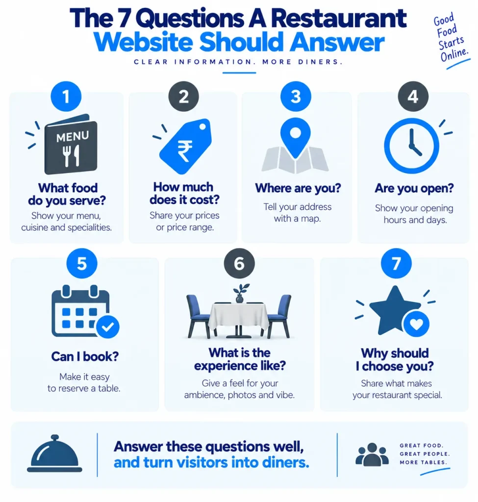
A restaurant visitor may be asking:
- What kind of food do you serve?
- How much does it cost?
- Where are you?
- Are you open today?
- Can I reserve a table?
- Can I order online?
- What does the restaurant look like?
- Is it suitable for families, dates, groups or business meals?
- Is parking available?
- What makes this restaurant different?
These questions are not all answered by the menu.
Current restaurant website guidance also places strong importance on making practical information such as the menu, hours, location and reservation option easy to find, especially for people visiting on mobile.
This gives us an important lesson for Restaurant Website Copywriting Mistakes: if the website answers only “What food do you serve?”, it is doing only one part of the customer’s decision-making job.
Mistake 1: The Homepage Says What The Restaurant Is, But Not Who It Is For
A restaurant can describe its food very well and still leave customers unsure whether the place is right for them. A family looking for a quiet dinner, a couple planning a date, a group arranging a birthday meal and someone looking for a quick lunch may all have different expectations from the same restaurant. If the homepage simply says “fine dining restaurant” or “best cafe in the city”, it does not give enough context.
Instead, the copy should explain the experience in a natural way.
For example:
“A relaxed neighbourhood cafe for breakfast, coffee, light meals and casual meetings, with indoor seating and outdoor tables available.”
This tells us much more than:
“A premium cafe offering an unforgettable experience.”
The first sentence gives the visitor a reason to see the restaurant as suitable for their needs. The second sentence uses a broad claim that could appear on almost any cafe website.
This is one of the most useful Restaurant Copywriting Tips: do not only describe what the restaurant sells; explain the kind of visit the customer can expect.
Mistake 2: The Website Uses Too Much Restaurant Language
Restaurant owners often know their menu very well, so it is natural to use terms that make sense inside the business.
But customers may not understand every cooking term, ingredient name or description.
For example:
“Our signature reduction is paired with a slow-cooked protein and seasonal garnish.”
This may sound suitable for a fine-dining restaurant, but it does not necessarily help someone understand what they are ordering.
A clearer description might be:
“Slow-cooked chicken served with our house sauce and seasonal vegetables.”
The second version is easier to understand without making the food sound ordinary.
The same principle applies to cafe websites. If a cafe serves several types of coffee, the website should help less experienced customers understand the difference instead of assuming everyone knows what each term means.
Good restaurant copy should make the food easier to imagine, not make the customer feel that they need to understand restaurant vocabulary before ordering.
Mistake 3: The Restaurant Tries Too Hard To Sound Premium
This is another common problem.
Words such as “luxurious”, “exquisite”, “world-class”, “culinary masterpiece” and “unparalleled” may sound impressive, but they often tell the customer very little.
For example:
“Experience an unparalleled culinary journey where exquisite flavours meet an elegant ambience.”
This could describe hundreds of restaurants.
A more useful version would be:
“Enjoy North Indian dishes, grilled kebabs and family-style meals in a quiet dining room near the city centre.”
The second version gives us something we can actually understand.
This is important when thinking about why restaurant websites fail. A restaurant may spend a lot of time trying to sound special while avoiding simple information that customers actually need.
Good copy does not have to sound fancy.
It has to sound specific.
Mistake 4: The Restaurant’s Difference Is Not Explained
A restaurant does not necessarily need a completely unique concept, but the website should give customers a reason to remember it.
Imagine two cafes that both sell coffee, sandwiches and desserts.
Cafe A says:
“We serve fresh food and quality coffee in a comfortable environment.”
Cafe B says:
“A small neighbourhood cafe focused on breakfast, fresh sandwiches and slow coffee, with quiet seating for people working or meeting during the day.”
Cafe B gives us a clearer picture.
The difference may be the food, atmosphere, location, service style, opening hours, seating, family-friendly environment, outdoor area or another genuine feature.
The copywriter’s job is to find that difference and explain it without exaggerating.
Mistake 5: The Homepage Makes The Visitor Search For Basic Information
This is one of the biggest Restaurant Website Copywriting Mistakes because it creates unnecessary work.
Imagine someone searches for a restaurant while already travelling through the area. They open the website and see a large food photograph, a long story about the chef and an animated introduction, but there is no obvious address, opening time or reservation button.
The website may look beautiful, but the visitor still has to search for the information they actually came for.
Restaurant websites should make practical details easy to find. OpenTable’s restaurant website guidance specifically recommends making information such as hours, location, menu and reservation links easy to find within seconds of landing on the site.
The copy should support this by using clear labels such as:
View Menu
Reserve A Table
Get Directions
Order Online
Call The Restaurant
These labels are much more useful than vague options such as “Explore”, “Discover” or “Begin Your Journey”.
Mistake 6: The Website Treats The Menu As The Whole Sales Page
The menu is important, but it should not have to do all the selling.
A customer may understand what the restaurant serves after reading the menu, but they may still not know why they should visit.
This is where supporting copy can help.
For example, instead of simply listing:
Butter Chicken — ₹420
Dal Makhani — ₹320
Garlic Naan — ₹120
the menu page could introduce the restaurant’s food with a short paragraph:
“Our menu focuses on North Indian comfort food, with familiar favourites alongside grilled dishes and seasonal specials. Portions are designed for sharing, and our team can help guests choose dishes based on spice preference or dietary requirements.”
Now the menu is doing more than listing prices.
It is helping the visitor understand the food experience.
A web-based menu is also generally easier to read and update than relying only on a downloadable PDF. Current restaurant website guidance recommends keeping menu information readable on the website itself, while a PDF can still be offered as an additional format when useful.
Mistake 7: The Website Does Not Sell The Experience
Food is only one part of eating at a restaurant.
People also buy the experience.
For a cafe, that might mean:
“A quiet place for morning coffee and casual meetings.”
For a family restaurant:
“Comfortable seating for family meals and small celebrations.”
For a date-night restaurant:
“A relaxed evening setting with intimate tables and a seasonal dinner menu.”
These statements help visitors imagine themselves in the space.
This is particularly useful when photographs are doing a lot of the visual work. The copy should explain what the visitor cannot always understand from an image, such as whether the restaurant is casual or formal, whether groups are welcome, whether reservations are recommended or whether the space is designed for quick meals or longer visits.
Mistake 8: The Restaurant Has Reviews But Does Not Use Them Properly
Reviews are useful because customers want to know what other people experienced, but simply adding a five-star rating does not tell us much.
A better website can use short genuine review excerpts that support the restaurant’s main selling points.
For example, if the restaurant wants to attract families, a relevant review might mention:
“Good place for a family dinner. The staff were helpful and the portions were easy to share.”
If the restaurant is known for coffee:
“Good coffee and a quiet place to sit for an hour.”
The review should be genuine and presented in a way that does not mislead visitors.
The copy surrounding the review can also explain what the business wants people to notice.
For example:
A Local Favourite For Casual Dinners
Then place a relevant genuine review below it.
The point is not to make every review sound like an advertisement. The point is to let customer experiences support the claims the website is already making.
Mistake 9: The Website Does Not Explain The Location Properly
A restaurant’s location is part of the product.
Someone may choose a restaurant because it is near their office, shopping area, home, hotel, metro station or another local point.
So instead of:
“Located in the heart of the city.”
we can provide useful information:
“We are on MG Road, two minutes from the main metro entrance, with parking available in the building next door.”
Only include details that are accurate and current, but make the location useful rather than decorative.
Google Business Profile also allows restaurants to add important links such as menus, online ordering and reservations, while customers may also use contact and messaging options where available. Keeping the website and Business Profile information aligned is therefore important for the customer’s journey.
Our earlier article, “How To Write A Google Business Profile Description That Gets Read” explains how restaurant information should remain clear and consistent across the website and local business listings.
Mistake 10: The CTA Is Too Weak
A restaurant website needs to help people take the next step.
But many websites end with something like:
“Learn More”
or:
“Contact Us”
These are not always wrong, but they are often less useful than a CTA that matches the customer’s intention.
For example:
- Reserve A Table
- View Today’s Menu
- Order For Delivery
- Get Directions
- Call For A Table
- Book A Private Event
The CTA should match what the restaurant actually offers.
A cafe that does not take reservations should not have “Book A Table” as its main button. A restaurant that only accepts bookings by phone should make the phone option clear rather than sending visitors to a form that nobody checks.
This is an important part of how to increase restaurant website conversions because the customer should never have to guess what action the website expects them to take.
Our earlier article, “15 Call to Action Button Examples for Local Business Websites” explains how restaurant CTAs should clearly describe the action the visitor can take.
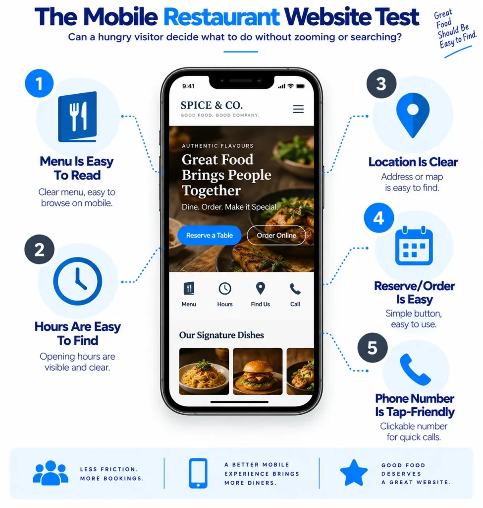
Mistake 11: The Website Is Written For Desktop Instead Of Hungry People On Phones
A restaurant website can look beautiful on a large screen and still be frustrating to use on a phone.
This matters because people often search for restaurants while they are away from their desks, travelling, shopping, walking around an area or deciding where to eat. OpenTable’s current restaurant website guidance also highlights mobile-first design and the importance of making key information easy to find on phones.
The copy therefore needs to work in a narrow space.
Headings should clearly tell the visitor what is underneath them. Buttons should be easy to tap. Important information should not be hidden inside long paragraphs, and the menu should be readable without forcing the visitor to download a document and pinch around it.
This does not mean making every paragraph one or two lines. It means writing useful medium-length paragraphs and then placing clear headings, buttons and lists around them so visitors can scan the page without losing the meaning.
Mistake 12: The Copy Is Too Long In The Wrong Places
Long copy is not automatically bad for a restaurant website.
The problem is writing long explanations before giving visitors the information they need.
For example, the restaurant’s story may be useful, but it should not take up the first screen while the menu and reservation button are hidden below it.
A good restaurant homepage can have a longer story further down the page, where people who want to learn more can read it. The first sections should focus on the practical decision: what the restaurant offers, where it is, what the experience is like and what the visitor can do next.
This is one of the most useful Restaurant Copywriting Tips because it is not about cutting words everywhere. It is about putting the right information in the right place.
A Better Restaurant Homepage Structure
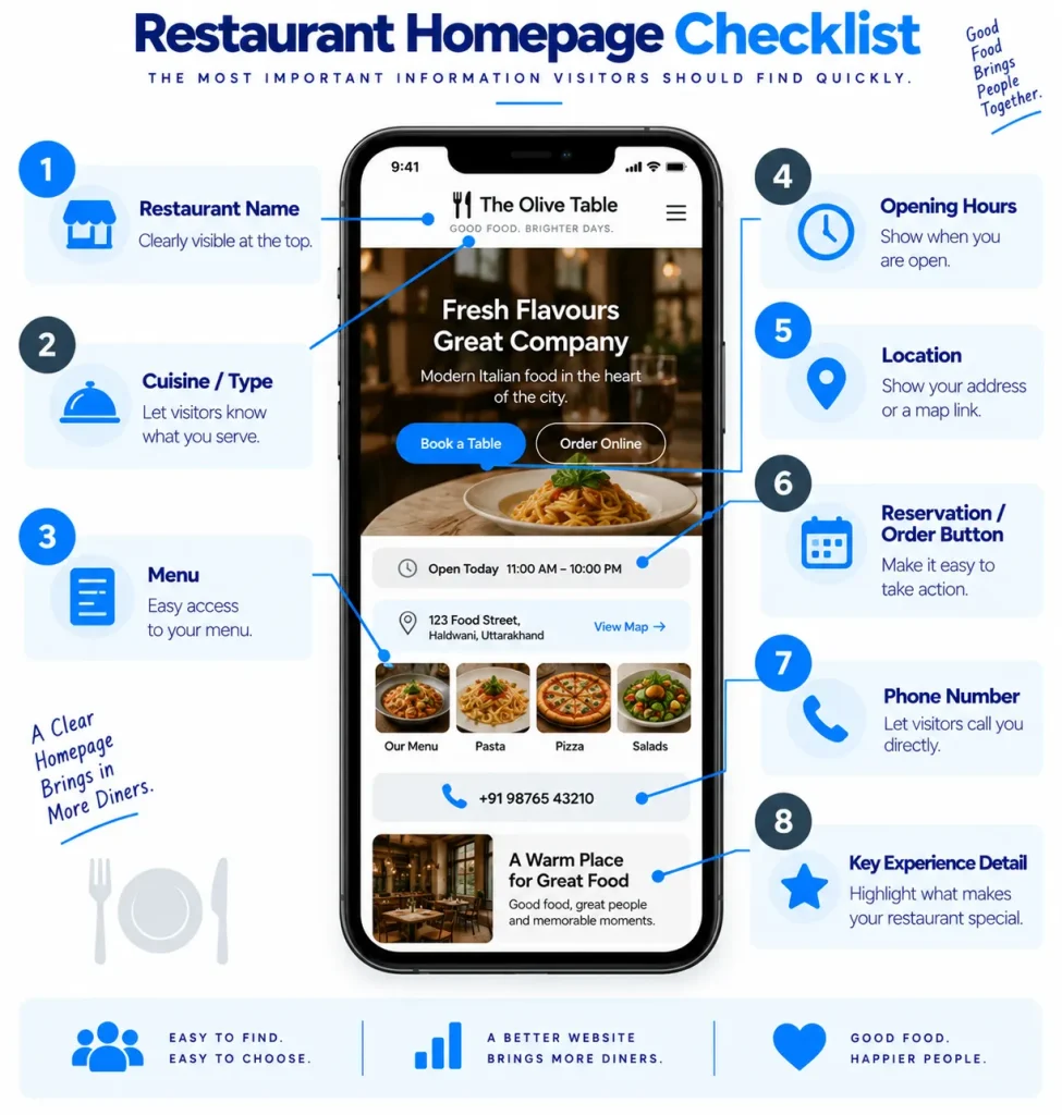
A simple structure for a restaurant or cafe homepage could look like this:
1. Restaurant Name + Clear Description
Riverside Kitchen
Casual North Indian dining and family meals in central Ghaziabad.
2. Main Action
View Menu | Reserve A Table
3. Short Experience Description
Explain what the restaurant is like and who it suits.
4. Popular Food Or Menu Categories
Show a few useful highlights rather than trying to reproduce the entire menu.
5. Why Visit
Explain genuine differences such as cuisine, atmosphere, private dining, outdoor seating or local speciality.
6. Photos
Show the food, dining space and other parts of the experience.
7. Reviews
Use genuine customer feedback.
8. Location And Hours
Make these easy to find.
9. Final CTA
Tell visitors what they can do next.
This structure keeps the website focused on the customer’s decision rather than making it a long company introduction.
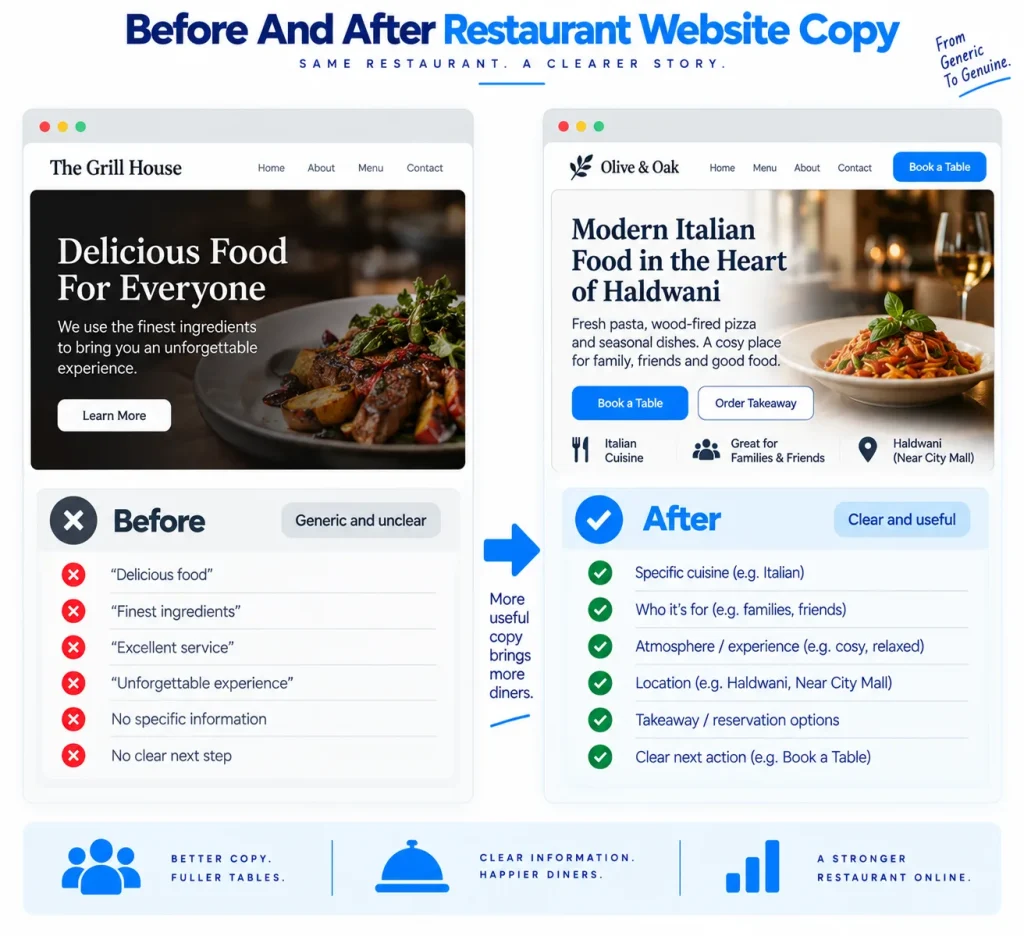
Before And After: Restaurant Website Copy Examples
Here is a simple example of how the same restaurant can sound very different depending on the copy.
Before
Welcome To Our Restaurant
We are a premium restaurant serving delicious food made with the finest ingredients. Our experienced chefs prepare every dish with care and passion. We believe in providing excellent food, excellent service and an unforgettable dining experience for all our customers. Visit us today and experience the difference.
This paragraph sounds positive, but almost every restaurant could use it.
After
North Indian Food For Family Dinners And Casual Evenings
Our restaurant serves North Indian favourites, grilled dishes and sharing plates in a relaxed dining space near the city centre. We welcome family dinners, small groups and casual evening meals, with takeaway also available. View the menu to see the current dishes and prices, or reserve a table before your visit if you are coming with a group.
The second version gives us a much clearer picture of the restaurant.
It tells us what food is served, what the experience is like, who the restaurant suits and what the customer can do next. That is the difference between copy that simply describes a business and copy that helps someone decide whether to visit.
What The Best Restaurant Websites Text Usually Has In Common?
The best restaurant website text is not necessarily the text with the most personality or the most beautiful words.
It is usually text that is specific enough to help the customer understand the restaurant.
For example, instead of:
“A dining experience like no other.”
we can say:
“A small vegetarian cafe serving South Indian breakfast, filter coffee and light meals throughout the day.”
The second sentence may sound less dramatic, but it tells us something.
This is also why Best Restaurant Websites Text should not be copied from another restaurant. A successful restaurant needs copy based on its own menu, customers, location and experience. What works for a fine-dining restaurant may not work for a family cafe, and what works for a coffee shop may not work for a takeaway-focused restaurant.
How To Increase Restaurant Website Conversions Without Redesigning Everything?
If a restaurant website already exists, we do not always need to rebuild it from scratch.
Start by checking the words and information already on the page.
Ask:
- Can visitors find the menu quickly?
- Can they see today’s opening hours?
- Can they find the address and get directions?
- Can they understand the restaurant’s type and atmosphere?
- Can they see what makes the restaurant different?
- Can they reserve, order or call without searching?
- Are the main buttons clear?
- Does the copy explain who the restaurant is suitable for?
- Are the claims specific and believable?
- Does the mobile version make the same information easy to find?
These changes can often improve the customer journey without changing the restaurant’s entire visual identity.
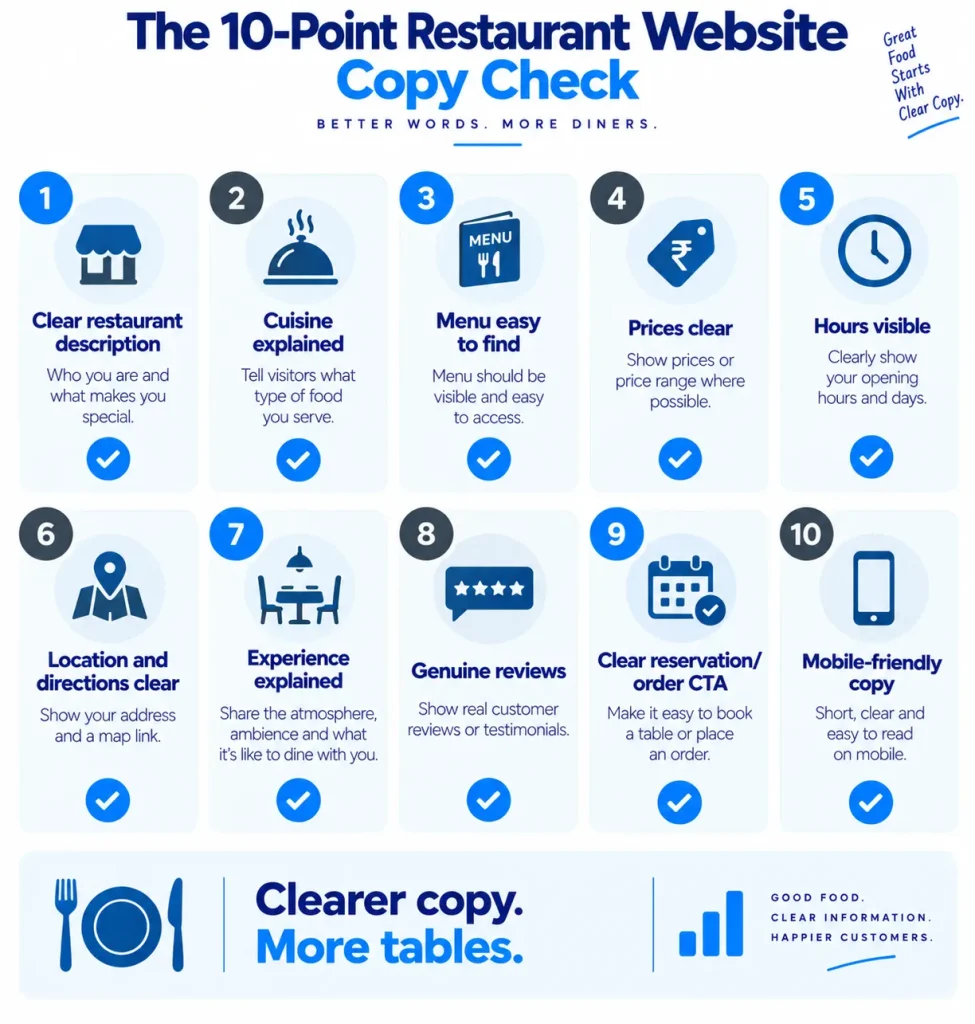
A Simple Restaurant Website Copywriting Checklist
Before publishing or rewriting a restaurant website, check the following:
- Does the homepage explain what type of restaurant it is?
- Does it tell visitors what kind of food is served?
- Is the menu easy to find and read?
- Are prices current?
- Are opening hours easy to find?
- Is the address clear?
- Can visitors get directions easily?
- Is the reservation or ordering option obvious?
- Does the copy explain the dining experience?
- Does the restaurant have a clear reason for someone to choose it?
- Are the claims specific rather than exaggerated?
- Are genuine reviews used where useful?
- Are the main CTAs clear?
- Does the copy work properly on mobile?
- Can a first-time visitor understand the restaurant without already knowing it?
If several answers are “no”, the website may have a copy problem even if the design looks good.
Final Thoughts
The biggest restaurant website problem is not always the menu.
A menu can be perfectly written and still fail to convert if the website does not explain the restaurant, its location, its atmosphere, its opening hours and the next step clearly. Customers are not only asking what they can eat. They are trying to decide whether this is the right place for them, whether it is open, whether it fits their occasion and how they can make the visit happen.
That is why Restaurant Website Copywriting Mistakes often appear in the spaces around the menu. The homepage may be full of beautiful photographs but say very little about the experience. The restaurant may have excellent reviews but hide them below a long story. The booking button may exist but be difficult to find. The address may be present but not connected to useful directions. These small problems can make a website less helpful even when the restaurant itself is excellent.
The solution is not to fill the website with more words. It is to write the right information in the right places, using simple language that helps people make a decision. Explain what the restaurant serves, who it is suitable for, what the experience feels like, where it is, when it is open and what the visitor can do next.
Good restaurant copy should make someone think, “Yes, this is the kind of place I was looking for.”
That is the real purpose of Restaurant Website Copywriting. The website does not need to sound more impressive than the restaurant next door. It needs to make the restaurant easier to understand, easier to trust and easier to visit.