
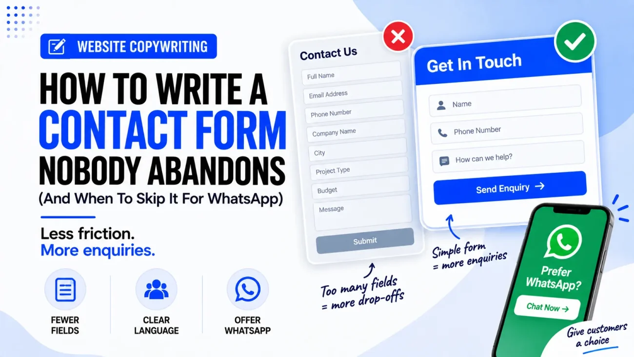
A contact form looks like one of the simplest parts of a business website. We add a name field, email address, phone number, message box and a button, then expect visitors to fill it in and contact the business.
But many contact forms are harder to complete than they need to be.
A visitor may arrive ready to ask a question, request a quote or book a service, but then see eight or ten fields asking for information that does not seem necessary. They may also see a button saying “Submit”, a large text box asking them to “Enter your message”, and no explanation of what will happen after they click the button.
This is where contact form copywriting becomes important.
The problem is not always the form design itself. Sometimes the words around the fields create doubt. Sometimes the form asks for too much information. Sometimes the visitor would rather send a quick WhatsApp message because that is how they normally communicate with small businesses.
A good contact page should therefore answer a simple question:
What is the easiest reasonable way for this customer to start a conversation with this business?
Sometimes the answer is a short contact form.
Sometimes it is WhatsApp.
And sometimes the best option is to offer both.
Why People Abandon Contact Forms
Before trying to improve a contact form, we need to understand why someone might leave it unfinished.
Imagine a customer has searched for a local interior designer and found a business they like. They click “Get A Quote” and see this:
- Full name
- Company name
- Job title
- Phone
- Address
- City
- Project type
- Budget
- Preferred date
- How did you hear about us?
- Message
The business may want all of this information, but the customer has not yet decided whether they even want to speak to the company.
From the customer’s side, the form may feel like work.
This is why how to reduce form abandonment should not start with button colours or clever wording. It should start with a much simpler question: which information is actually needed at this stage?
Nielsen Norman Group recommends tracing form fields to a clear purpose and removing or simplifying fields that are not necessary. It also recommends looking at field-level abandonment and other behaviour data to understand where people stop completing a form.
Baymard’s research similarly shows that large numbers of visible fields can make forms feel intimidating, although its detailed research is focused mainly on checkout rather than ordinary contact forms.
The principle still applies well to contact pages.
Contact Form Copywriting Starts With The Customer’s Question
The first thing a contact form should communicate is not:
“Fill in this form.”
It should communicate:
“Tell us what you need, and we will help you with the next step.”
That small difference changes the feeling of the page.
Compare these two introductions.
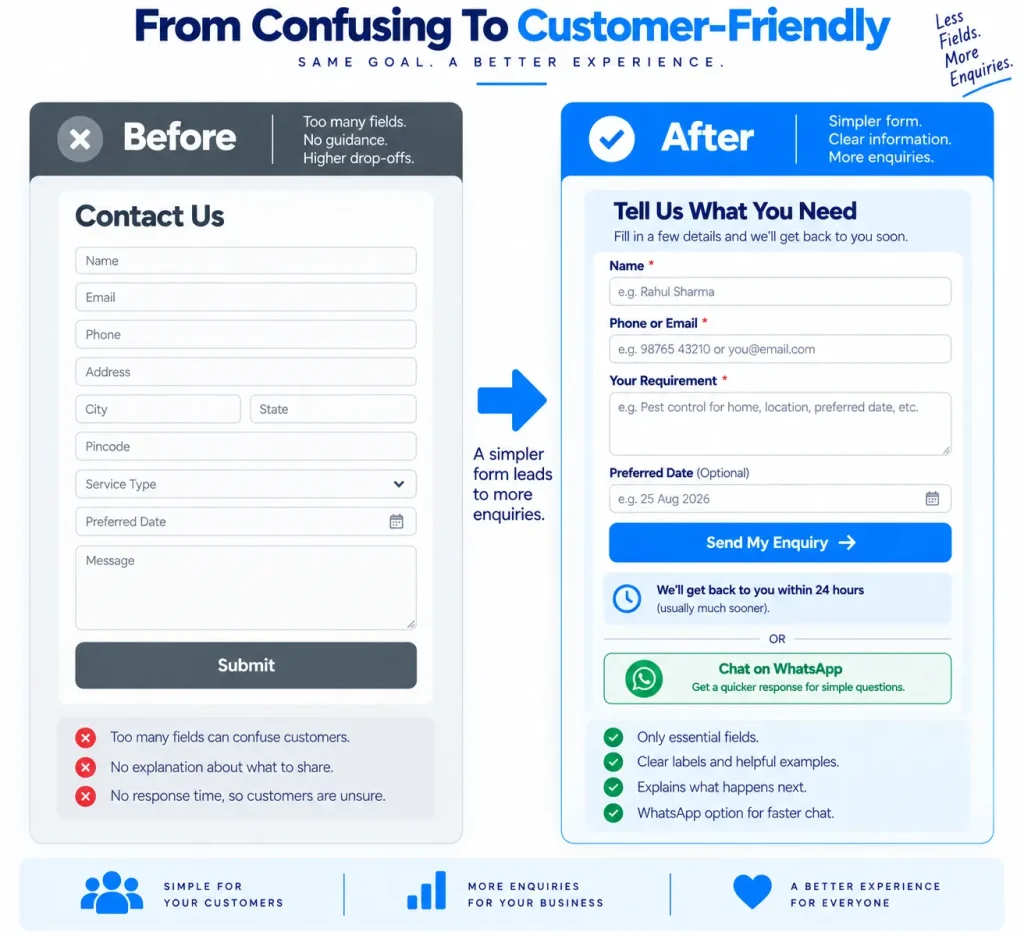
Before
Contact Us
Please fill out the form below and we will get back to you.
After
Tell Us What You Need
Have a question about our service, need a quote or want to check availability? Send us a few details below and our team will review your enquiry and get back to you.
The second version gives the visitor a reason to complete the form and tells them what the business will do with the information.
That is an important part of contact form copywriting because people are not filling out a form for the sake of filling out a form. They are trying to start a conversation.
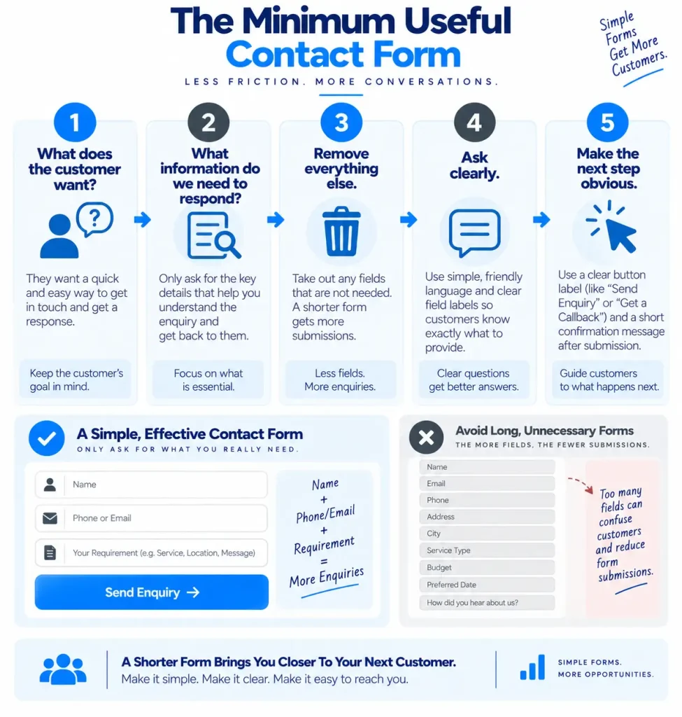
Ask Only For Information You Actually Need
This is probably the biggest change we can make to a contact form.
Suppose a local plumber needs to know:
- Name
- Phone number
- Location
- Problem
There may be no reason to ask for:
- Company name
- Job title
- Full postal address
- How they heard about us
- Preferred communication method
- Detailed project history
The shorter form may be much easier for someone who needs help quickly.
This does not mean every contact form should have three fields.
A business that needs project information before giving a useful quote may need more.
An architect may need project type, location, approximate size and budget.
A wedding planner may need event date, venue, guest count and service requirement.
A B2B company may genuinely need a company name and work email.
The rule is not “always use fewer fields”.
The better rule is:
Every field should have a clear reason for being there.
If we cannot explain why the business needs a field, we should question whether the customer needs to complete it.
Write Better Labels Instead Of Clever Labels
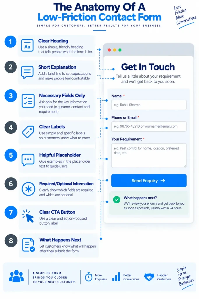
A form field should be easy to understand.
For example:
Name
is clearer than:
How should we address you?
And:
Phone number
is clearer than:
Best number to reach you on
The second version is not terrible, but the first is faster to understand.
This becomes even more important on mobile, where users may be scanning the form quickly.
Baymard recommends clear labels positioned close to their fields and warns against relying on placeholder text as a replacement for labels. Labels should remain understandable after the user starts typing.
So instead of:
[ Enter your name here ]
use:
Full name
[ Priya Sharma ]
The placeholder can provide an example if useful, but it should not carry the entire meaning of the field.
Contact Page Placeholder Text Examples
Good placeholder text can reduce uncertainty, but it should be short.
Here are some useful examples.
Name
Label: Full name
Placeholder: Priya Sharma
Phone
Label: Phone number
Placeholder: 98765 43210
Label: Email address
Placeholder: name@example.com
Location
Label: Your area or city
Placeholder: Indirapuram, Ghaziabad
Service
Label: What do you need help with?
Placeholder: Bathroom renovation
Message
Label: Tell us a little about your requirement
Placeholder: I need a quote for a 2-bedroom flat…
The important thing is not to turn the placeholder into a long instruction. The user should be able to understand the field from the label alone.
Tell People Why You Are Asking For Personal Information
Some information can make people pause.
A phone number is a good example.
If the form asks:
Phone number
the visitor may wonder why the business needs it.
A small line of helper text can remove that doubt:
Phone number
We may call you to discuss your enquiry.
Or:
Phone number
We will use this only to respond to your enquiry.
The business should only make privacy statements that are accurate and supported by its actual practices.
The point is to answer the customer’s question before they have to ask it.
Baymard’s research on form usability also notes that explanations can reduce confusion when personal information is requested, especially when users are unsure why information is needed.
Make Required And Optional Fields Obvious
Another small problem can create unnecessary friction: unclear required fields.
Imagine a form contains:
- Name
- Phone
- Company
- Message
The visitor does not know whether Company is required.
They may try to submit the form and receive an error.
Or they may wonder whether the company is asking for information they do not want to provide.
Clear labels such as:
Phone number *
Company name (Optional)
remove that guesswork.
Baymard’s research has found that unclear required and optional field rules can cause confusion, validation errors and abandonment.
For a small business contact form, this is easy to improve.
Do not make people guess.
Contact Form Button Copy Matters
The final button is often treated as an afterthought.
That is a mistake.
A button saying:
Submit
tells the visitor almost nothing.
It describes what the website does with the form rather than what the customer gets from completing it.
Better options can include:
- Request A Quote
- Send My Enquiry
- Ask A Question
- Check Availability
- Request A Callback
- Get In Touch
- Send Enquiry
The right option depends on what happens next.
If the business sends a quotation, Request A Quote makes sense.
If the form is simply for general questions, Ask A Question may be better.
If the business calls the customer after receiving the form, Request A Callback explains the next step.
This is a useful part of contact form conversion rate optimization because the button should make the action clear rather than forcing the user to interpret “Submit”.
Our earlier article, “15 Call to Action Button Examples for Local Business Websites” explains how button wording can explain the action and make the next step clearer.
Explain What Happens After The Form Is Sent
One of the simplest ways to make a contact form feel safer is to explain what happens next.
For example:
What happens after you enquire?
We will review your message and contact you using the details you provide. If you are asking for a quote, we may ask a few additional questions before giving you an estimate.
This is much better than:
We will get back to you soon.
“Soon” can mean five minutes or five days.
If the business has a real response time, it can say:
We normally respond during business hours within one working day.
But again, only promise a response time the business can actually maintain.
The same principle applies to the confirmation message after submission.
Instead of:
Your form has been submitted.
write:
Thanks, we received your enquiry.
Our team will review your message and contact you during business hours. If your request is urgent, please call us directly.
This makes the next step clear.
When WhatsApp May Be Better Than A Contact Form
Now we reach the second part of the question.
Should every small business website use a contact form?
No.
For some businesses, WhatsApp can be a much easier way to start a conversation.
This is particularly true when the customer is likely to ask a quick question rather than submit a detailed enquiry.
For example:
“Are you open on Sunday?”
“Do you deliver to Vaishali?”
“Is this phone available?”
“Can someone visit tomorrow?”
“Can you send me the price?”
A customer may prefer to tap WhatsApp and type the question immediately rather than complete a five-field form. This is why WhatsApp vs contact form should not be treated as a simple winner-versus-loser comparison. They solve slightly different problems.
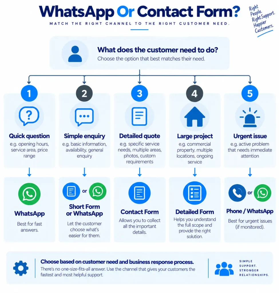
WhatsApp Vs Contact Form: Which One Should We Use?
A simple way to think about the choice is this:
| Situation | Better starting option |
|---|---|
| Quick question | |
| Simple local service enquiry | WhatsApp or short form |
| Quote requiring several details | Contact form |
| Project requiring documents | Contact form |
| Product availability question | |
| Booking request | Depends on booking process |
| B2B sales enquiry | Contact form |
| Customer needs a fast reply | WhatsApp, if actively monitored |
| Detailed enquiry | Contact form |
| Customer wants a written record | Either, depending on business process |
The key phrase here is “starting option.”
A business can offer both.
For example:
Need a quick answer?
Message us on WhatsApp.
Want to send project details?
Use our enquiry form.
This gives customers a choice without making the page confusing.
When To Use WhatsApp On A Website
There are several situations where WhatsApp can make sense.
1. The Business Already Uses WhatsApp
If the team already handles customer questions through WhatsApp, adding it to the website may fit the existing workflow.
2. Customers Ask Short Questions
If most enquiries begin with simple questions, WhatsApp can remove unnecessary form friction.
3. The Business Can Reply Promptly
This is very important because a WhatsApp button does not help much if messages are ignored for hours or days. Customers often use messaging because they expect a conversation, not because they want another contact form in a different format.
4. The Business Serves Local Customers
Small local businesses often communicate with customers through messaging apps already, particularly for quick questions, appointment discussions and location sharing. But WhatsApp should only be promoted as a fast contact option if the business actually monitors it.
When A Contact Form Is Better
A form is often better when the business needs structured information.
Imagine a website for an interior designer.
A useful enquiry might need:
- Project location
- Property type
- Approximate size
- Project stage
- Service required
- Expected timeline
- Budget range
- Message
Sending all of this through WhatsApp may create a long conversation where the business repeatedly asks for missing details.
A structured form can collect the information in one place.
The same applies to:
- B2B enquiries
- Recruitment enquiries
- Large projects
- Website development
- Construction work
- Legal enquiries
- Custom manufacturing
- Event planning
- Detailed quotation requests
In these cases, a contact form may be more efficient for both sides.
The Best Contact Method For A Small Business Website May Be Both
There is no need to make customers choose one communication method before they have even contacted the business.
A simple contact page could say:
How Would You Like To Contact Us?
Need a quick answer?
Message us on WhatsApp and ask your question.
Want to send project details?
Use the enquiry form and tell us what you need.
Prefer to speak to someone?
Call us during business hours.
This is often a better approach than forcing every visitor through the same process.
The important thing is to keep the choices clear.
Three contact methods are not useful if the visitor cannot understand which one to choose.
Do Not Put WhatsApp On The Website And Ignore It
This sounds obvious, but it is one of the biggest problems with using messaging as a conversion channel.
If the website says:
Chat With Us On WhatsApp
but the business takes two days to respond, the button creates the wrong expectation.
A form can sit in an inbox and be processed later.
A messaging button feels more immediate.
Therefore, when to use WhatsApp on website depends partly on whether the business has a real process for managing those conversations.
If the company receives hundreds of WhatsApp messages, it may need a proper process for assigning enquiries and responding to them.
If one business owner manages the phone and WhatsApp personally, the website copy should not promise instant replies unless that is actually possible.
The contact method should match the operation behind it.
Contact Form Drop-Off Can Happen For Reasons Outside The Form
It is also important not to blame every abandoned form on the form itself.
A person may leave because:
- They changed their mind.
- They were only researching.
- The price was too high.
- They found another business.
- They became busy.
- They wanted WhatsApp instead.
- The page loaded slowly.
- The form produced an error.
- They did not trust the business enough to share their details.
This is why reduce contact form drop-off should be approached with actual website data where possible.
If analytics or form software shows that many users start the form but leave after the phone number field, investigate that field.
If people reach the form but almost nobody starts it, the problem may be the page, offer or CTA.
If people complete the form but the business rarely responds, the problem is not conversion copywriting. It is the follow-up process.
Nielsen Norman Group specifically recommends looking at field-level abandonment, time spent and engagement rather than relying only on an overall completion number.
A Simple Contact Form Copywriting Formula
For a small business, we can use this formula:
1. Tell them what they can do
Tell Us What You Need
2. Explain why they should complete it
Send us a few details and we will review your enquiry.
3. Ask only for useful information
Name
Phone
Requirement
4. Remove uncertainty
We will contact you during business hours.
5. Make the button describe the action
Send My Enquiry
6. Offer another route if it makes sense
Prefer WhatsApp? Message us here.
This is simple, but it covers most of the important copy decisions.
Before And After: A Contact Form Rewrite
Here is a complete example.
Before
Contact Us
Please fill out the form below.
Name
Phone
Company
Address
City
Service
Budget
How did you hear about us?
Message
Submit
The problem is not that every field is automatically bad.
The problem is that the customer does not know why they are being asked for most of this information or what will happen after they submit it.
After
Tell Us What You Need
Looking for a quote, have a question or want to check whether we can help with your project? Send us a few details below and our team will review your enquiry and get back to you during business hours.
Full name
So we know who we are speaking with.
Phone number
We may call you to discuss your enquiry.
Email address
We can use this to send information or follow up.
What do you need help with?
Tell us about the service or project.
Anything else we should know? (Optional)
Add any useful details here.
Send My Enquiry
Prefer a quick conversation? Message us on WhatsApp.
The second version feels like a conversation rather than an interrogation.
That is the main goal of good contact form copywriting.
Small Details That Can Make The Form Easier
Once the main copy is right, there are several smaller details worth checking.
Keep The Form In One Main Column
Do not rely only on text inside a field that disappears when the person starts typing.
A simple vertical structure is generally easier to follow than a form that spreads fields across several columns. Baymard’s research has found multi-column form layouts can be misunderstood, and recommends a single primary column for form fields.
Keep Labels Visible
Give Useful Error Messages
Instead of:
Invalid input.
write:
Please enter a valid phone number.
The user should know what needs fixing.
Do Not Erase Everything After An Error
If a user has spent two minutes writing a detailed enquiry and one field is wrong, losing the entire message can be very frustrating. Preserving user input when errors occur is a recognised form usability issue.
Check The Form On A Phone
A large percentage of local business traffic can come from mobile devices, so the form should be comfortable to use with a phone keyboard, clear labels and a sensible amount of scrolling.
A Contact Page Is More Than A Form
The form itself is only one part of the contact experience.
The page should also answer:
Where is the business?
When can I contact them?
How quickly do they normally respond?
Can I call?
Can I use WhatsApp?
What information should I send?
What happens after I enquire?
For a local business, this information can remove more friction than changing the wording of the submit button.
This is also why the best contact method for a small business website should be decided as part of the whole customer journey rather than by copying whatever another website is doing.
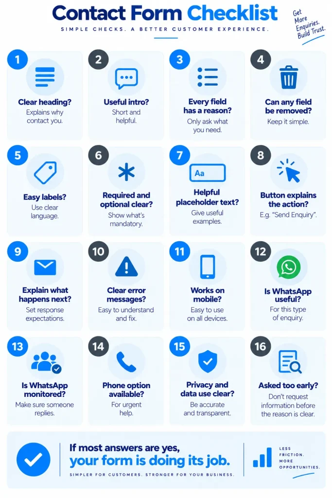
Final Contact Form Checklist
Before publishing or redesigning a contact page, check the following:
- Does the heading explain why someone should contact the business?
- Is the introduction short but useful?
- Does every field have a clear reason?
- Can any field be removed?
- Are labels easy to understand?
- Are required and optional fields clear?
- Is the placeholder text useful rather than essential?
- Does the button describe the action?
- Does the page explain what happens after submission?
- Are error messages easy to understand?
- Does the form work properly on mobile?
- Is WhatsApp useful for this type of enquiry?
- If WhatsApp is offered, does someone actually monitor it?
- Is there a phone option when customers may need urgent help?
- Are privacy and data-use statements accurate?
- Is the form asking for information before the customer understands why it is needed?
If the answer to most of these questions is yes, the form is probably doing its job.
Final Thoughts
A contact form should not feel like paperwork.
It should feel like an easy first step towards getting help, asking a question or starting a conversation.
That is why good contact form copywriting is not about finding one perfect button phrase or removing every possible field. It is about understanding what the customer wants to do and then asking only for the information needed to help them move forward.
For some businesses, a short form with four or five useful fields may be the right answer. For others, a longer form may be reasonable because the business needs project details before it can respond properly.
And for some small businesses, WhatsApp may be the easier first contact method, especially when customers usually ask short questions and the business can reply promptly.
The best solution may also be both: a short form for detailed enquiries and WhatsApp for quick conversations.
The important thing is to stop asking, “What information do we want?” and start asking, “What does the customer need to do, and what is the least information we need to help them?”
That change in thinking can make a contact page clearer, easier to use and more respectful of the customer’s time.
And that is where contact form copywriting becomes more than writing labels and buttons. It becomes part of the customer experience from the first click to the first real conversation.