
When someone reads our website on a laptop, there is usually enough space for longer lines, larger sections and several elements to appear together on the screen. On a phone, the same content feels very different because the screen is smaller, the reader may be scrolling with one thumb, and there may be notifications or other distractions competing for attention. This is why how to write for mobile users is not only about making the font smaller or making every paragraph short. It is about deciding what the reader needs first and presenting that information in a way that is easy to scan, understand and act on.
Mobile readers do not always read a page from the first sentence to the last sentence. Eye-tracking research from Nielsen Norman Group shows that people scan web pages in different patterns, including the well-known F-shaped pattern, and this behaviour can also appear on phone screens. Descriptive headings, useful first words and clear sections can therefore help readers find the information they need without reading every word.
Why Writing for a Phone Is Different
The first thing to understand about mobile writing is that the reader’s environment is different. Someone may be sitting at home and carefully reading an article, but they may also be checking our website while waiting in a shop, travelling, standing in a queue or trying to find a service quickly. We cannot control the reader’s situation, so our writing has to work even when the reader gives us only a small amount of attention at a time.
This does not mean that every mobile article should become a collection of one-line sentences and tiny paragraphs. That style can make an article feel broken and unnatural. Good mobile writing still needs explanation and useful detail, but the information should be divided into comfortable sections so that the reader can pause, scan and continue without facing a large wall of text.
Mobile Readers Often Scan Before They Read
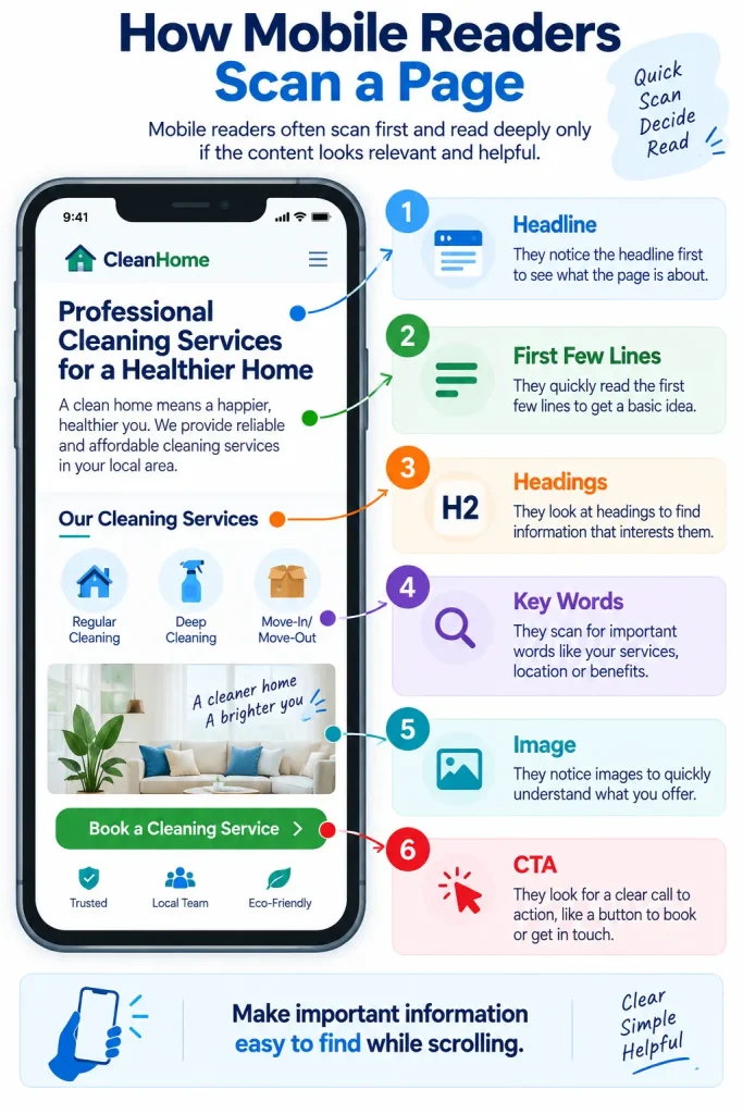
A person visiting our website may first look at the headline, then the first few lines, then the headings, bold words, images or highlighted information before deciding whether the page is worth reading. Research on web scanning has found that headings can support a layer-cake scanning pattern, where readers move between headings and the information below them to find the parts that interest them.
This is why how to write for mobile users should begin with structure rather than sentence length. If our headings tell the reader exactly what each section is about, the reader can understand the main value of the page simply by scrolling through it. A heading such as “Make Your First Screen Useful” tells much more than a vague heading such as “The Beginning.”
Start With the Information the Reader Needs
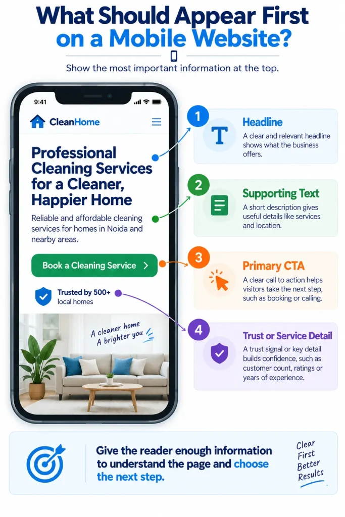
One of the easiest ways to improve mobile copy is to stop making the reader wait for the answer. If the page is about how much a cleaning service costs, the first section should start explaining the pricing approach instead of spending several paragraphs introducing the company. If the page is about emergency plumbing, the first screen should quickly tell the visitor what service is available and how to contact the business.
This is especially important for service websites because a mobile visitor may already know what they want. They may be searching for an electrician, plumber, cleaning company or local repair service and simply need to confirm whether our business can help. Good mobile content formatting puts the most useful information close to the beginning and moves secondary details further down the page.
For example, instead of beginning with:
“For many years, our company has been proud to provide a wide range of professional services to customers in the local community.”
We could write:
“Need an electrician in [City]? We handle emergency repairs, lighting work and common electrical problems. Call us to discuss the job and check availability.”
The second version gives the reader useful information much sooner.
Our earlier article, “How to Write a Headline for a Local Service Website” explain how the first screen of a local service website should communicate the service and customer benefit clearly.
Keep Paragraphs Comfortable on a Small Screen
Paragraph length matters because a paragraph that looks reasonable on a large monitor can become much taller on a phone. However, this does not mean we need to force every paragraph into one or two lines, because doing that repeatedly can make the article feel unnatural and difficult to follow.
A better approach is to keep most paragraphs around three or four lines on a normal phone screen, depending on the font and screen size. Each paragraph should normally cover one connected idea, and when the idea changes, we can start a new paragraph so that the reader gets some visual breathing room.
Nielsen Norman Group also recommends simplifying formatting for mobile content and notes that shorter paragraphs, more white space and larger readable text can make content easier to use on smaller screens.
This is one of the most practical rules for how to write for mobile users because it improves the page without requiring complicated design changes.
Use Headings That Tell the Reader Something
A heading should help the reader decide whether the next section is worth reading. This becomes even more useful on mobile because headings are often the first things a person notices while scrolling through a long article.
Compare these two headings:
“Our Approach”
and
“Make the First Screen Answer the Main Question”
The second heading gives the reader a reason to continue because it explains what the section will teach. We do not need to make every heading clever or dramatic, but we should make it specific enough that someone can understand the topic without reading the paragraph underneath it.
Writing for mobile devices therefore involves writing for the scrolling experience as much as writing for the actual reading experience.
Do Not Make Every Sentence Extremely Short
There is a common misunderstanding that mobile writing means every sentence should be five or six words long. That can make copy sound like an advertisement or a list of instructions instead of something written by a real person.
Good mobile copy can still use longer sentences when the ideas are connected, as long as the sentence is easy to follow and does not contain unnecessary words. We should remove complicated wording, repeated ideas and filler, but we should not remove natural sentence flow simply because the content is being read on a phone.
For example:
“We clean homes. We clean offices. We clean shops. We offer good service. Call today.”
This is easy to read but does not sound natural or informative.
A better version would be:
“We provide regular and one-time cleaning for homes, offices and small shops, with flexible services based on the type of property and the cleaning work needed.”
The second sentence contains more information while still being easy to understand.
Make the First Few Lines Useful
The opening paragraph has an important job because the reader has not yet decided whether the page is worth their time. We do not need to reveal everything immediately, but we should give the reader a clear idea of what they will get from the page.
A useful opening can answer the main question, explain the problem or tell the reader what the article will help them do. For example, an article about writing a plumber homepage could start by explaining why visitors need to know the service, location and next step quickly.
The first few lines should not be filled with general statements such as “In today’s digital world” or “As technology continues to evolve.” These phrases use valuable space without helping the person who is already looking for an answer.
Write Short Hooks Without Making Them Sound Fake
A hook is the first line or opening idea that encourages someone to continue reading. On mobile, a useful hook can be especially important because the reader can easily scroll away or return to the search results.
A good hook does not have to be dramatic. It can simply identify a problem that the reader understands.
For example:
“Your website may look fine on a laptop but become difficult to read on a phone.”
This works because it introduces a problem that many website owners can recognise.
Another example is:
“If customers have to zoom in to read our service page, the copy is already creating extra work for them.”
The best how to write short hooks approach is usually simple: introduce a real problem, useful question or clear benefit instead of trying to sound exciting.
Use the First Words of a Sentence Carefully
When people scan content, they do not always read every word, so the beginning of a sentence can carry more weight than the words at the end. This is one reason it is useful to put the important information early instead of hiding it behind a long introduction.
Compare:
“When you are looking for a reliable local cleaning company, one of the things you may want to consider is whether the company offers regular cleaning.”
With:
“Regular cleaning is available for customers who want ongoing help with housework.”
The second version reaches the main point faster and is easier to understand while scrolling.
This does not mean every sentence must start with a keyword, because that would make the writing repetitive. It simply means we should avoid putting the useful information at the end of every sentence.
Use White Space as Part of the Writing
White space is not wasted space. On a phone, it helps separate one idea from another and makes the page feel easier to approach.
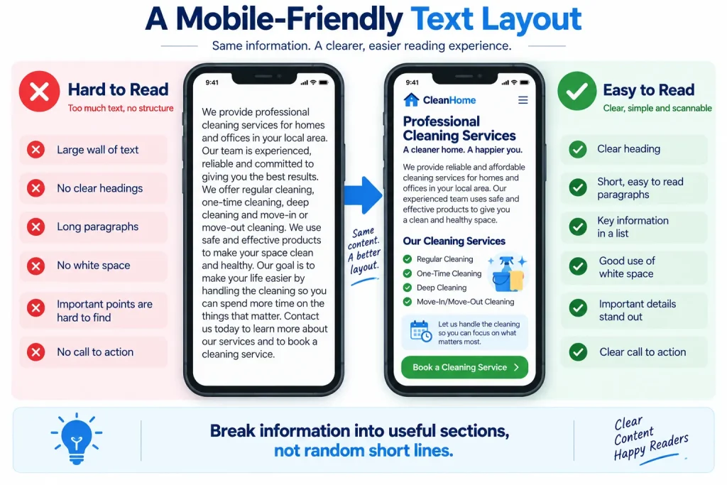
If a page contains several large paragraphs with no headings, lists or visual breaks, the reader may see a large block of text before they even start reading. Breaking the article into clear sections allows the reader to understand its structure while scrolling.
This is why formatting text for smartphones should be considered part of copywriting rather than something that belongs only to the designer. The words, headings, paragraph breaks, images and buttons all work together to create the reading experience.
Use Bullets When They Make Information Easier
Bullets are useful when the reader needs to compare or scan several related items, but using them after every paragraph can make the whole article feel like a checklist.
For example, a cleaning service could use bullets for the main tasks included in a service:
- Kitchen surfaces
- Bathroom cleaning
- Vacuuming
- Mopping
- Dusting
This is easier to scan than placing all five tasks into one long sentence. However, the explanation before and after the list should still use normal paragraphs so the page has a natural flow.
A good rule for mobile reading habits is to use formatting where it genuinely helps the reader find information, not simply because the content is being viewed on a phone.
Make Buttons Easy to Understand
Mobile users have less space around buttons, so button text should explain what happens after the tap. A button saying “Submit” gives very little information, while “Request a Quote” tells the visitor what the action means.
For a local service business, useful CTA examples may include:
- Call for a Quote
- Book a Cleaning
- Check Availability
- Request a Callback
- Get Service Details
The best choice depends on what happens after the user taps the button. The important thing is that the button should match the next step instead of using clever language that makes the user guess.
This is a basic part of UX copywriting for mobile, because a button is not only a design element; its words help the user decide what to do.
Keep Forms Simple on Mobile
Forms can become frustrating on phones because typing takes more effort than clicking on a desktop keyboard. If a local service business asks for fifteen pieces of information before allowing someone to request a quote, some visitors may simply leave.
Only ask for the information needed for the next step. A simple enquiry form might ask for a name, phone number, service needed and a short description of the job, while more information can be collected later if necessary.
Form labels should also be clear. “Your details” is less useful than “Your phone number,” especially when the visitor is filling out the form quickly.
Mobile microcopy tips therefore include keeping field labels clear, explaining what information is needed and making error messages helpful rather than blaming the user.
Do Not Hide Important Information Behind Clever Copy
Clever copy can work in some situations, but clarity should come first when the reader is trying to complete a task.
If a button is meant to start a booking, “Let’s Get Things Moving” may sound friendly but does not tell the visitor what will happen. “Book an Appointment” is much clearer.
The same applies to headings, navigation labels and form instructions. Mobile users should not have to solve a small puzzle before understanding the website.
Good how to write for mobile users practice is therefore often less about finding impressive words and more about removing unnecessary uncertainty.
Think About the Thumb When Placing CTAs
Mobile visitors usually interact with the screen through touch, often while holding the phone in one hand. This means the physical placement of buttons and other controls matters, although copywriters do not always control the exact design.
Our role is to make sure the CTA itself is clear enough that the designer or developer can place it in the right part of the page. If the most important action is “Call Now,” the copy should not bury that action under several paragraphs of background information.
For example, an emergency electrician page may need the phone number and emergency service message near the beginning, while company history can appear further down the page.
The principle is simple: put the action close to the information that gives the reader a reason to take it.
Answer Search Intent Early
Someone searching on a phone often wants an answer quickly, particularly when the search is connected to a service or problem. If the page is targeting “how to write website copy for a plumber,” the introduction should tell the reader what the article will explain instead of spending several paragraphs discussing the general importance of websites.
This also helps us write better SEO content because the page becomes useful to the person who arrives from search rather than simply repeating the target keyword.
Google’s search guidance focuses on useful, people-first content rather than content written only to manipulate search rankings, so mobile SEO should be treated as part of creating a better page for the reader rather than as a separate trick.
Our earlier article, “The 30-Point Website Copy Checklist” explain all the wider checks we should make before publishing website copy.
Page Speed Still Matters to the Writer
Copywriters do not control every technical part of page speed, but writing and content choices can still affect the page experience. Large images, unnecessary visual elements and heavy media can make a page slower, which matters when someone is accessing the website through a mobile connection.
Google’s current documentation continues to treat page experience and Core Web Vitals as part of the broader search and user-experience picture.
This does not mean we should remove every image from an article. Instead, images should have a purpose, be properly prepared for the web and support the information rather than simply filling empty space.
Use Images That Help the Reader
A visual can explain something faster than a paragraph, especially when the reader is scrolling on a small screen. For example, a before-and-after image can show a website copy change, while a simple process infographic can explain the steps in a service journey.
The important thing is that the image should support the surrounding text. If we place five decorative images between sections without adding useful information, the page becomes longer without becoming more helpful.
Captions can also be useful because readers often look at an image and then read the short text immediately around it. This makes captions another opportunity to explain why the visual matters.
Make Long Articles Easy to Navigate
A 2,000-word article does not automatically become difficult to read on mobile. The problem usually comes when the entire article is presented as one continuous block.
Long articles should have a clear structure, useful H2 and H3 headings, occasional lists, examples and visual breaks. A reader should be able to scroll through the article and understand what each section covers without having to read every paragraph first.
This is why writing for mobile devices is not simply about reducing the total word count. It is about making the information easier to navigate so that a reader can choose what deserves their attention.
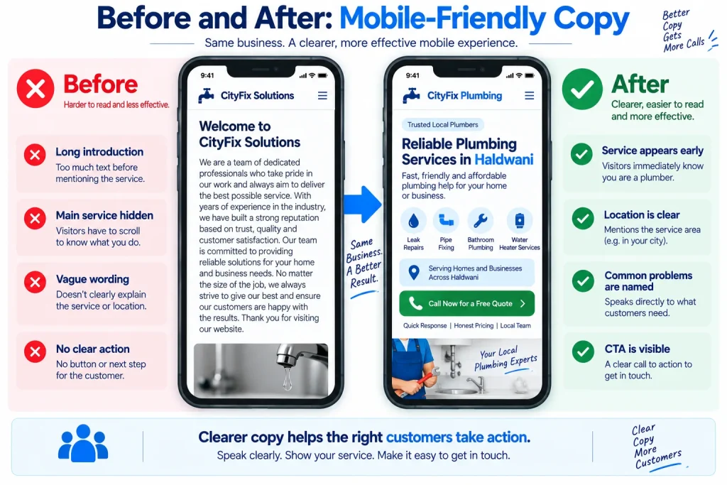
Example: Turn Desktop-Style Copy Into Mobile Copy
Imagine a local plumber has written this paragraph:
“At our plumbing company, we are committed to providing our customers with the highest quality plumbing services and we have many years of experience in dealing with all types of plumbing problems, whether they are small repairs or larger emergency situations, and our team is always available to help customers with their plumbing needs.”
The paragraph contains useful information, but the main point is hidden inside a long sentence.
A more mobile-friendly version could be:
“We handle everyday plumbing repairs and emergency plumbing problems across [Service Area]. Our team can help with leaks, blocked drains, faulty taps and other common plumbing issues.”
The second version is not simply shorter. It is easier to scan because the service, location and main problems are visible quickly.
Read Your Own Article on a Phone
One of the easiest ways to understand mobile writing is to actually read the finished article on a phone before publishing it.
Do not only look at the desktop preview and assume that the page will feel the same on a small screen. Open the actual page, scroll through it naturally and notice where the content feels crowded, where a heading is unclear, where a paragraph looks too long and where the next action becomes difficult to find.
This simple test can reveal problems that are difficult to notice while writing on a large computer screen.
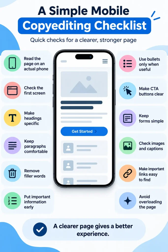
A Simple Mobile Copyediting Checklist
Before publishing a page, read it once as a normal visitor rather than as the person who wrote it. Ask whether the first screen explains what the page is about, whether the headings make sense without the paragraphs, and whether the important information appears early enough.
Then check the actual wording and formatting. Remove repeated phrases, unnecessary introductions and words that do not add meaning, while keeping enough explanation for the article to feel complete and natural.
Use this final checklist:
- Read the page on an actual phone.
- Check the first screen.
- Make headings specific.
- Keep paragraphs comfortable.
- Remove filler words.
- Put important information early.
- Use bullets only when useful.
- Make CTA buttons clear.
- Keep forms simple.
- Check images and captions.
- Make sure important links are easy to find.
- Check that the page is not overloaded with visual elements.
The Difference Between Short Copy and Useful Copy
A mobile page should not be short simply for the sake of being short. A customer looking for an emergency electrician may need several important details, and removing those details just to create a smaller page would make the content worse.
The better goal is to remove unnecessary reading rather than necessary information. We can explain a service properly while still making the page easy to scan by using clear headings, medium paragraphs, useful examples and a logical order.
This is an important distinction because how to write for mobile users is really about reducing effort, not reducing value.
Final Thoughts
People do not use their phones only when they have plenty of time to read. They use them while travelling, waiting, comparing businesses, solving problems and looking for quick answers, which means our website copy needs to respect the way mobile readers actually use a screen.
Good mobile writing uses clear headings, useful opening lines, comfortable paragraphs, simple language and direct calls to action, while still giving the reader enough information to make a decision. Research into mobile usability supports this focus on readability, scanning and simpler presentation rather than simply shrinking desktop content onto a smaller screen.
The next time we write a service page, blog post or homepage, we should not ask only, “Does this sound good?” We should also ask, “Can someone understand this while scrolling on a phone?” If the answer is yes, our copy has a much better chance of being useful to the people who actually visit the website.